Email Design Elements
We are already halfway down 2021, and email marketers are looking for some inspiration to make the second half a bit more interesting. When we talk of email design, interactivity is one such feature that is the most discussed yet underutilized. And I don’t blame email developers for that. The support for tech innovations across email clients has been cold since the beginning, and using advanced functionalities can often result in backfiring for marketers.
However, this doesn’t mean that we completely give up on interactivity in email development. Given the fact that 82% of people seek interactive email design, it is a must-have for your email strategy. Today, I will share my two cents on interweaving interactive features in your email templates based on my hands-on experience as an HTML email developer for some of the globe’s leading brands. Buckle up to know more.
Table of Contents
Accordions

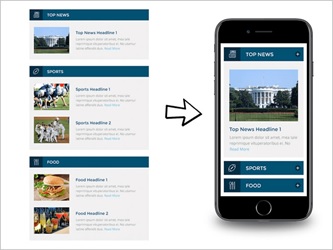
Accordions are extremely popular as an interactivity feature as they help bring near-app experience in emails and slash off the length of the message. Another aspect that works in their favor is the fact that it makes navigation easier for the recipients and allows them to get the sections relevant to the subscribers. Thus, you can pack extensive information in your email templates without worrying about the message feeling like a lot of topics/data crammed into a small space. Also, you need not worry about losing engagement. Thus, providing your readers with the ability to control how they view your message with accordions can be a game-changer if you are struggling with low engagement and click-thru rates.
Carousels

If you are looking to pack images instead of text, you can find carousels, the old-time darling of web designers, as the perfect fit for your email design. It works best in the horizontal layout where you can display different products, while the normal 1:1 or vertical layouts are equally helpful provided that you use them appropriately. The good thing is that if you are willing to direct the reader to a single landing page, the CTA button remains in the ballpark for all images displayed, making it a better choice for many scenarios.
Hover Effects

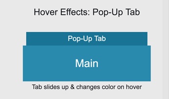
If you are looking for simple yet eye-catching interactive additions, the hover effect could be the best choice. The hover effect usually works well with cursors as the fading of the background or highlights to the email elements wouldn’t fare well with the touchscreens in most cases.
Scratch Cards

Scratch cards are one of the popular physical tactics that made it to the digital world, and they can be a great value addition to your email design strategy. Digital scratch cards are more suitable for mobile users as they can imitate the physical action, which isn’t a pleasant experience for computer users though manageable. Have a look at the below in-mail scratch card from Bose:
HTML 5 Videos

HTML 5 videos are among the most common interactive features added to email design. Adding a video to your message can be a great value addition as they allow the recipients to interact through voice and images along with a storyline. You need to keep in mind that the video must be hosted3 on a third-party app like YouTube and add subtitles to make it more accessible.
GIFs

Last but not least, GIFs are yet another interactive element that falls under the category of rich multimedia. They fit in the case where you need something more than a still image and a bit less than a video as it blends the best of both worlds. You can use GIFs to illustrate certain features of your product or simply use them as a storytelling prop for your message.
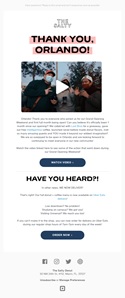
We had a look at different elements that you can use to infuse interactivity in your email design, but it is important to note that it’s more about how creatively you use them than how eye-catching these effects are. Being able to make the recipient feel amused is the goal when implementing interactive email design. In the below example, we can clearly find that a simple change can create a wonderful visual appeal:
Summing Up
Depending on your needs, you can use different interactive elements but don’t go overboard as you need to check support from the email clients of your subscriber base. The elements we discussed here are fairly supported, but they might need you to make certain alterations to maintain renderability. But it is worth going the extra mile as you can emerge as a unique brand among the mundane emails that your subscribers receive regularly. As the support is vamped up, you can also ask your email developers to design custom email templates with JavaScript and other relevant technologies to implement API interfacing for providing a near website user experience. I hope this article helps you understand the common interactive email design elements.
Author Bio
Kevin George is Head of Marketing at Email Uplers, one of the fastest growing full service email marketing agency, that specializes in professional email template creation and PSD to HTML email conversion; they are Marketo certified experts. Kevin loves gadgets, bikes, jazz and eats and breathes email marketing. He enjoys sharing his insights and thoughts on email marketing best practices on his blog.
